Lookin' Good! Design Tips for Authors
/
You, as the author, are your brand. You need to have a consistent look and feel with your website, business cards, newsletter, blog, and social media pages. Here are some tips for making your presence look unified, professional, and planned.
Get a professional headshot. Selfies shouldn’t be used on websites or book covers. Make sure that you update it every two or three years (or if your look changes). Don’t be one of those authors who uses the same photo for twenty years.
When you make a graphic to be shared on social media posts, make sure to choose the size that fits that platform. I use Canva, and it has a series of templates for each site that are sized correctly. The templates vary whether it’s a post, banner, or event. You also don’t want to stretch or resize a post graphic for a banner. It won’t look good.
When you use a photo or graphic, make sure that it is sized so that it can be viewed. I’ve seen author bookmarks where you can’t see the book cover or title. Also make sure it is proportional. Some people stretch the graphic, and it’s too skinny or too fat.
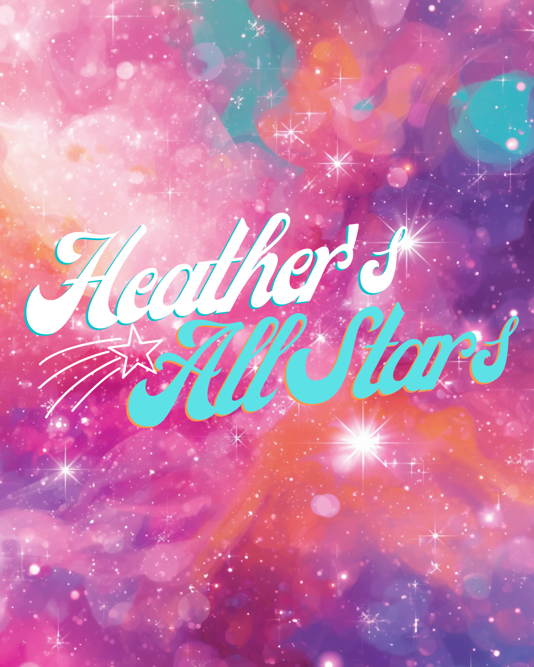
Pick colors that are complimentary and match your style of writing. My first published work was a story in a mystery anthology with a black, white, and red cover. I used those colors on my website and social media pages. When I talked to a publicist about my author sites later, she recommended that I choose brighter colors since my mysteries were light and humorous. You can use a color wheel to help you choose complimentary colors. There are lots of free ones on the internet.
Make sure you use a quality, high resolution graphic or photo for print and web. If not, it will look pixilated or grainy and not professional.
You may want to consider getting a logo for your name. It is another graphic that you can use on your sites.
If you use a photo other than yourself on your social media sites, make sure to have something like a logo that identifies it as you. This helps people find you.
When you’re making graphics or bookmarks, LESS is better. Don’t cover the entire graphic with text. Focus on important things like title, URL, ISBN, and book cover. Too much, dense text is hard to read.
Some authors use business cards or postcards instead of bookmarks. It’s a neat give-away that doesn’t cost that much to produce.
When you create business cards, bookmarks, or postcards, make sure to use both sides. I tend to put my latest book on the front of the bookmark, but I put the other series on the back
I made notecards/post cards with my book covers. I put the covers on one side and left the back in white. I use these to write notes. And If you don’t want to use it as a postcard, it will slip into an invitation or other sized envelope.